EXCEL 2007: Histogram
A. Colin Cameron, Dept. of Economics, Univ.
of
Calif. - Davis
This January 2009 help sheet gives information on how to
-
create histograms in Excel
-
variations on a histogram
DATA
We read in the following data on house sale prices in Central Davis
in 1999, measured in thousands of dollars.
375, 340, 310, 279.9, 278.5, 273, 272, 270, 270, 258.5, 255, 253, 249,
245, 244, 241, 239.5, 238, 236.5, 235, 235, 233, 230, 229, 224.5, 220,
213, 212, 204.
[One way to get this data into column format is to cut the data into
a text editor and manually type in enter after each observation and
delete
the comma].
Simplest is to open the file housepricedata.csv
HISTOGRAM
There are 29 observations. Interpretation of the data is made
somewhat
easier by the data already being ordered (if it is not ordered we can
order
it using Data Tab | Sort command). But it is useful to collapse the
data further.
A histogram does this by counting the number of observations
that fall within a certain range (a "bin") and then plotting this
frequency
against the bin value.
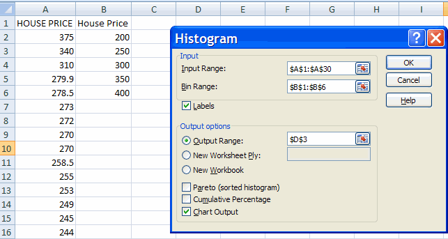
In Excel choose Data Tab and Data Analysis within the Analysis
group.
[Note: if the Data Analysis group is not there then see Excel 2007: Access and Activating the
Data Analysis Add-in
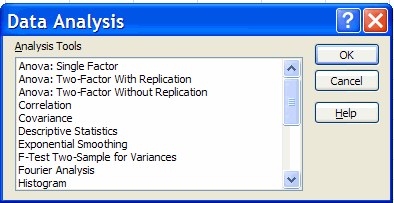
This yields the Data Analysis dialog box, which has histogram as an
entry.
Highlight histogram and click okay.
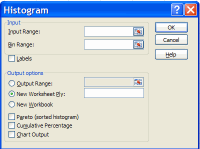
-
For input range either type in by hand the input range (e.g. A1:A30
where
A1 is a label such as Sales Price) or select the data range on the
spreadsheet
by clicking on the first entry (the label) and then dragging the mouse
down and de-clicking at the last data entry.
-
For bin range either put in nothing, in which case Excel will choose
the
bin range, or better still give your own bin range, explained further
below.
-
For labels click Labels if you have provided a label for the data
(always good
practice).
-
In output range click and give a cell which has at least, say, 10 free
cells to the right and 15 free cells below it). If the data are in
column
A a good choice might be, say, cell C3. Alternatively you can put the
chart
on a new worksheet but then it is more difficult to keep track of where
the chart originated from.
-
Select Chart output (but not Pareto or cumulative percentage).
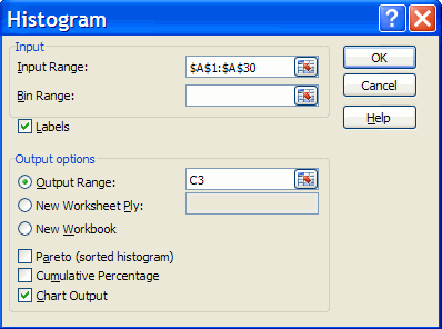
Hit OK. This gives the following histogram.
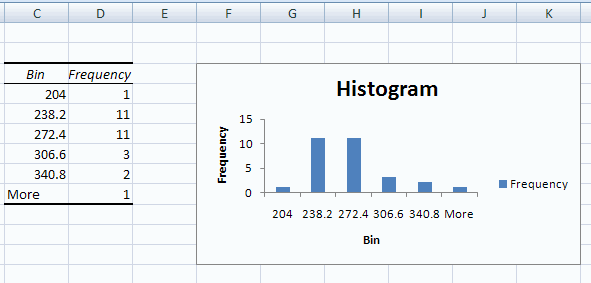
For this data
Excel has chosen six intervals with boundaries 204.0, 238.2, 272.4,
306.6,
340.8.
The general rule Excel uses is equal-width intervals with the number
of intervals approximately equal to the square root of the number of
data
points.
For these data the number of intervals seems reasonable but the cell
boundaries are not nice rounded numbers.
Rounding
off to the nearest $50,000 seems natural, so we might choose the
interval
boundaries as 200, 250, 300, 350 and 400.
This choice can be done by creating
a bin. In, say, columns B1:B6 type, respectively House Price, 200, 250,
300, 350, 400.
(The entry in B1 will be used to automatically label the
x-axis of the histogram).
In Excel choose the data Tab and Data Analysis within the Data group
and then histogram and hit the histogram
key.
-
Provide the same outputs as earlier, which Excel should automatically
display.
(change the output range to a new value if you want to keep the first
histogram).
- Provide the Bin range by either type in by hand the bin range
(e.g.
B1:B6 where B1 is a label such as Sales Price) or select the data range
on the spreadsheet by clicking on the first entry (the label) and then
dragging the mouse down and de-clicking at the last bin entry.
Then hit OK. We obtain
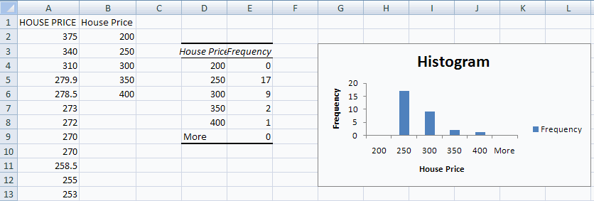
Now the interval boundaries are nice rounded numbers.
Further improvements
to the histogram are:
- Expand the size of the histogram by highlighting the chart area
and dragging on the bottom right corner.
- Provide a clear histogram title such as House Sale Prices in
Central Davis
1999 which is input by clicking on the chart title area and changing
the
text.
-
Delete the Frequency Legend Entry on the right-hand side (here
frequency)
by clicking on it and hitting the delete key.
Further details on improving the presentation of graphics is given in Excel:
Charts (bar, column, pie, line).
For example, consider the following
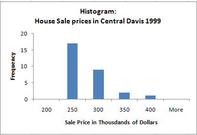
Interpretation: Excel
labels the histogram by
using the upper value in the interval.
Thus the frequency of 17 labeled
under 250 means that there were 17 observations in the sample that took
values greater than 200 and less than or equal to 250.
It would be clearer
to label this interval using its midpoint of 225, and this is done by
some
other programs.
You can move the chart within the worksheet by clicking on it, leaving
the mouse depressed, and drag the mouse.
If you need to enlarge the chart size, then resize the entire chart
by putting mouse icon on bottom right hand corner of chart and dragging
down to appropriate size.
VARIATIONS ON A HISTOGRAM
Variations on a histogram are
-
Select Cumulative percentage to have an additional line added to the
chart
which shows the cumulative frequency distribution, with scale given on
the right-hand side.
-
Select Pareto (sorted histogram) to order the histogram categories by
the
frequency of occurrence. This is useful for categorical data but less
useful
for numerical data which are already naturally ordered.
-
Select both Pareto (sorted histogram) and Cumulative percentage to get
a histogram sorted by frequencuy of occurrence and the associated
cumulative
frequency distribution.
For further information on how to use Excel
go to http://cameron.econ.ucdavis.edu/excel/excel.html