EXCEL 97: Two-Way Plots including Regression using Add Trendline
A. Colin Cameron, Dept. of Economics, Univ. of
Calif.
- Davis
This January 2009 help sheet gives information on
- Two-way scatter plots.
- Trendline (regreesion line) for two-way scatter plots.
- Customizing the two-way scatter plot.
For considerable detail on the basics of chart making see:
Excel 2007: Charts (column, pie, line)
TWO-WAY SCATTERPLOTS
A two-way scatter plot has one variable (say Y) on the
vertical
axis and one variable (say X) on the horizontal axis.
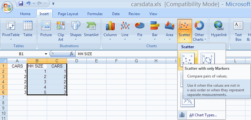
This is done by choosing the Insert Tab and the Charts Group and
Scatter option.
We use data in file carsdata.xls to
produce a scatterplot with CARS on the vertical axis (Y-axis) and
HHSIZE on the horizontal axis (X-axis).
The scatterplot is an XY scatterplot, so the data in the Excel
spreadsheet should be in two adjoining columns, with the X variable
followed by the Y variable.
For our example we need HHSIZE followed by CARS.
- So we first copy column A to column C.
- Then highlight columns B and C.
- Then choose the Insert Tab and the Charts Group and Scatter and
then Scatter Only with markers

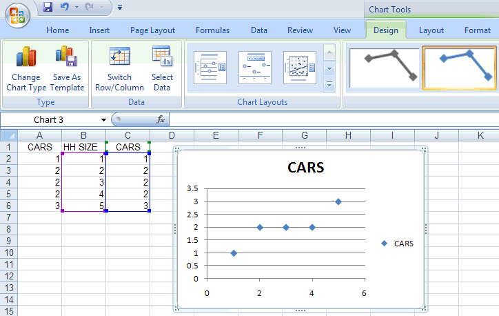
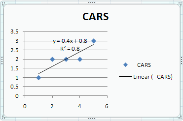
This yields the following plot

TRENDLINE FOR TWO-WAY SCATTERPLOTS
A separate trendline (or regression line) can be added after the
chart
is created by
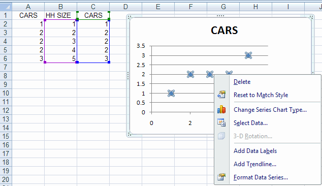
- Clicking on a point within the chart so that all the point on the
chart
are highlighted (this is tricky)
- Right-click to get options including Add Trendline
We have

Then select Add trendline.
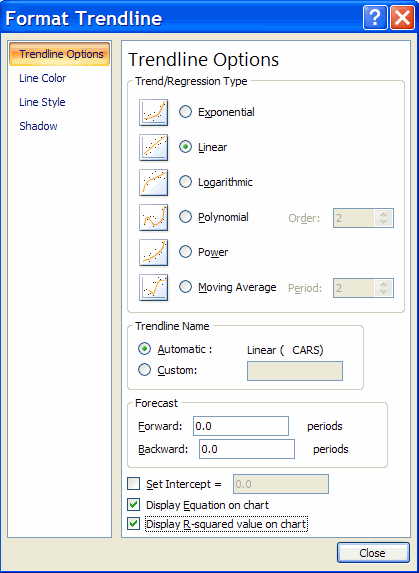
This yields the Format Trendline dialog box.
- Select linear (the default)
- Select Display Equation on chart
- Select Display R-Squared value on chart

Hitting Close adds a trendline to the data.

CUSTOMIZING THE TWO-WAY SCATTERPLOT
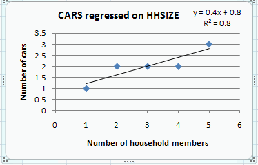
The look of the scatter plot can be improved. We do the following
- Delete the redundant legend on the right (CARS --- Linear (CARS)
- Move the equation formula and R^2 (drag the box).
- Change the heading text and reduce the font
- Add a title for the horizontal access as follows
- In Chart Tools choose Layout then Axis Titles Primary Horizontal Axis
Title then Title below Access
- Right in the title in the title box
- Add a title for the horizontal access as follows
- In Chart Tools choose Layout then Axis Titles Primary Vertical Axis
Title then Rotated Title below Access
- Right in the title in the title box
We obtain

For further information on how to use Excel go to
http://cameron.econ.ucdavis.edu/excel/excel.html
